One of my favorite things is to share how a cover came about, and this one was really fun to put together.
I say that, though I wasn’t the one who actually did it – that honor goes to Kelley York at Sleepy Fox Studio. Kelley’s a good friend, and a former almost-neighbor – she lived in the greater Sacramento area until a few years ago, and was a part of our Queer Sacramento Author’s Collective. Now she’s moved somewhere up north… Redding? Seattle? Nome? But we still keep in touch, and when I started discussing the cover design with my new publisher, I recommended her work for this cover.
But before that ever happened, I’d been working with another talented artist – LJ Phillips – on some character designs that I thought I might use as part of the cover. Before we dive into the final cover design process, I thought it would be fun to share some of the character evolution from that project:
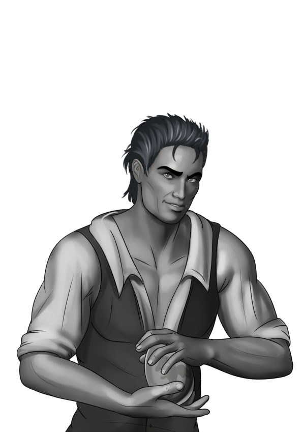
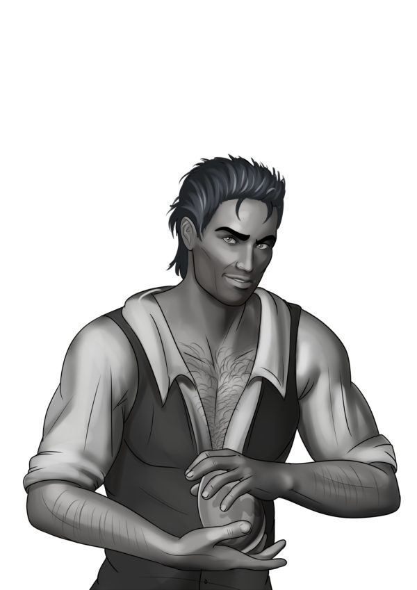
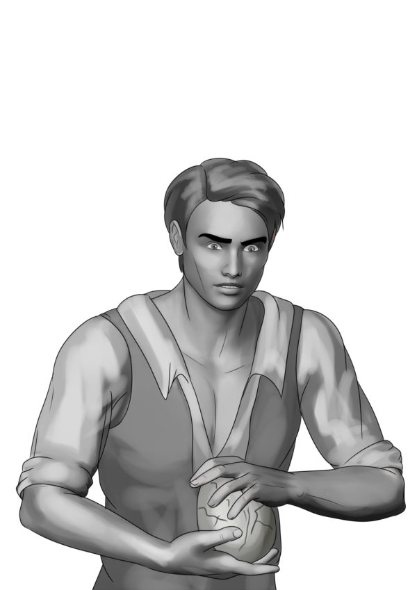
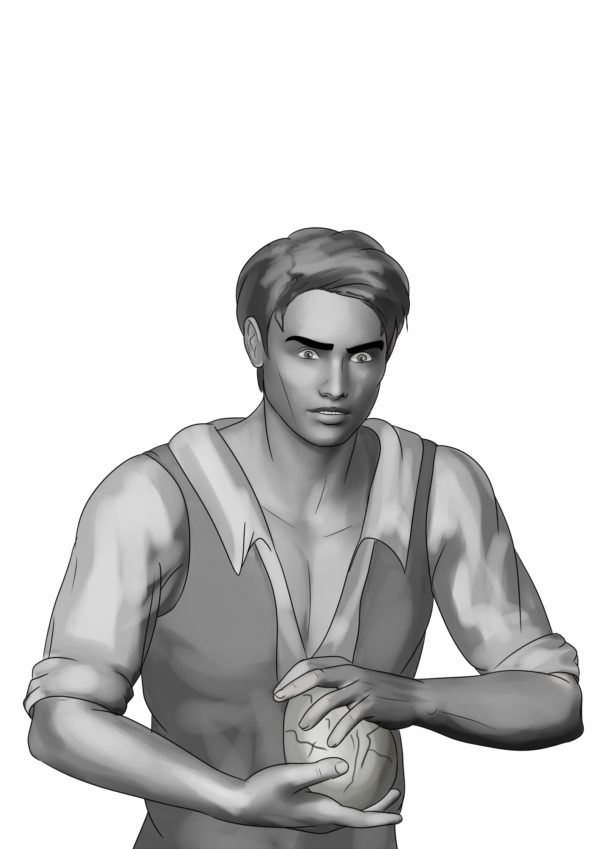
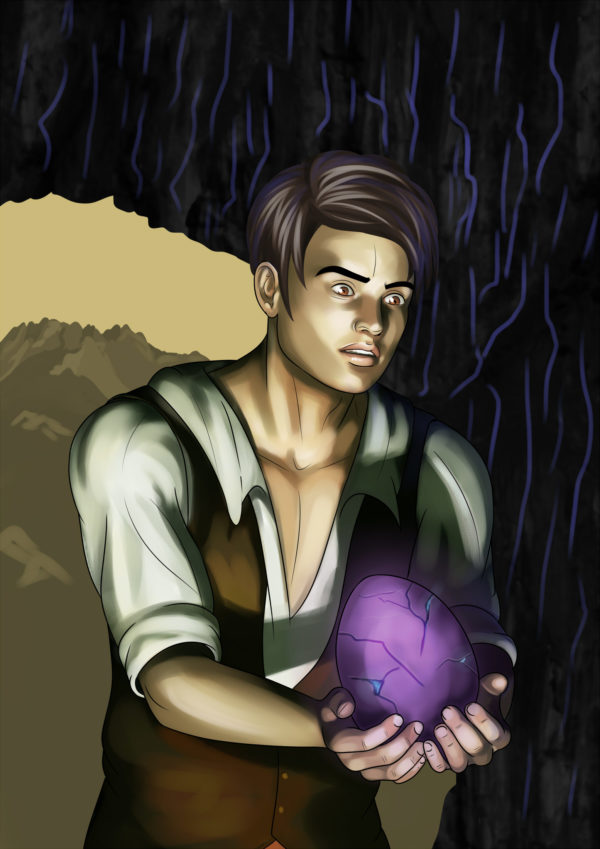
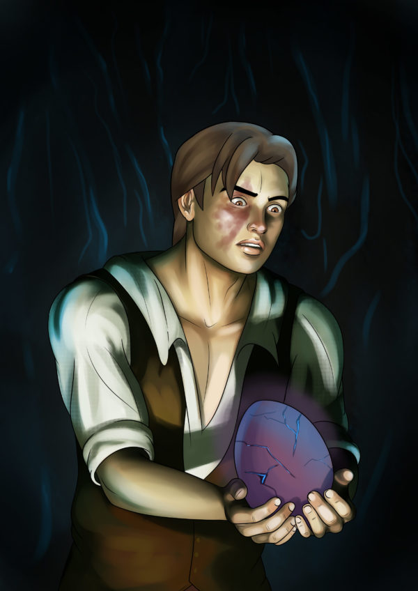
LJ does amazing work, and I still plan to use these – in fact, I already have, as teasers for the release of The Dragon Eater. They also helped me zero in on what I wanted the characters to look like.
When I started working with Kelley, she generated an initial piece of art using a modeling program. This is NOT the same as generative AI – it does not “borrow” (steal) styles from other artists to create its work. The artist has full control over the tool, and in this case overpaints it to make it look more human once the underlying art is created. So the first go came out like this:
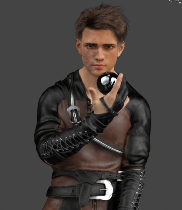
Not bad, but he looked a little too “tough. Raven is a sensitive (if cocky) soul, and the pose wasn’t quite right. But I LOVED the clothes. So Kelley generated another version with a different pose and a little slimmer face:
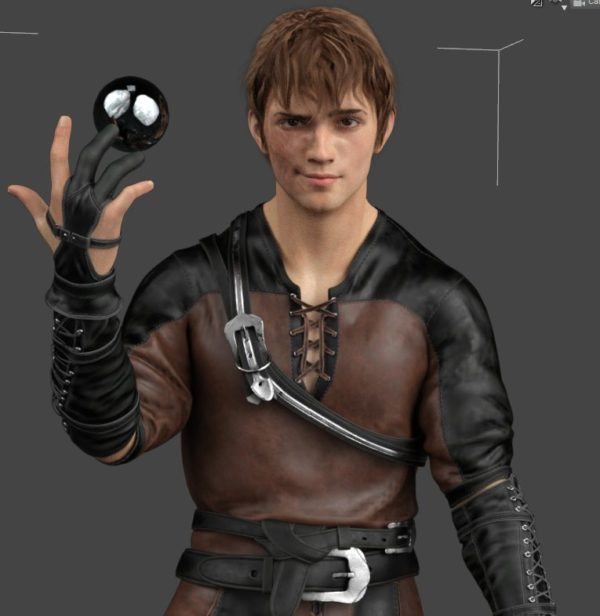
Not bad. The face is much better, but the hair – not quite right. For some reason, I’ve always pictured Dean from Gilmore Girls (aka Sam from Supernatural, which is weird, because his brother is Dean… but I digress). In short, I want floppy hair. Oh, and could we make him a little snarkier? So Kelley runs another one:
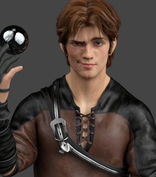
Bingo! The perfect hair. But maaaaybe… too snarky? So it’s back to the modeler for poor Kelley, who by this point has to be wondering how she go saddled with such a determined and picky client:
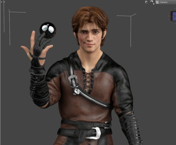
Perfect. It’s the Raven of my dreams. (Kelley lets out a huge sigh of relief).
Now what about the background? In the story [minor spoiler alert], Raven lives in a cave with black walls and glowing blue seams. So how to get this cool effect? For this, we turned to some actual photos of ice castles, like this one in Minnesota:

But it was a bit too light in places and a bit too purple in others. So Kelley worked her magic, and voila:

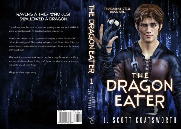
Put it all together, and you get the print wrap (pre-text):
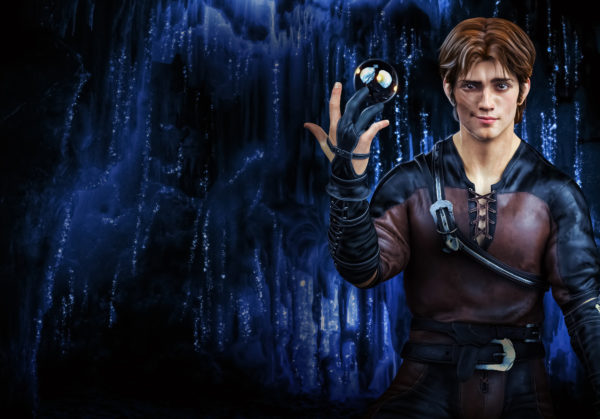
And the final wrap with the beautiful text. I love the cover font, and the book came out more beautiful than I could have imagined.
I can’t wait to start on book two with Kelley.
(strangled sound of desperation in the background)
All the preorder links are up, and if you order the book and email me a proof of purchase (to scott@jscottcoatsworth.com), I’ll send you the special prequel book with three stories (one brand new) – Tales From Tharassas, on March 16th (release day).
