Designing a cover is hard.
My first such effort, years ago, was limited by my skill at manipulating things in Photoshop, as well as my lack of expertise in finding good images to work with.
The latter still takes me the longest – I have to really consider the story as a whole and think about what might represent it. And then I have to find it.
That often takes hours and hours, paging through stock photo sites and following “More Images Like This” rabbit holes when I see something I like that’s not quite right. I’ll often have ten windows open, advancing through each image set, one at a time, putting things I like into my favorites folder.
Sometimes I suddenly run across one that feels perfect, and I’m done. Other times, I go back and look at what I’ve collected, and then some ideas begin to emerge.
For Dropnauts, it was more of the latter.
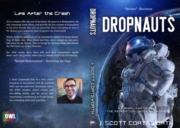
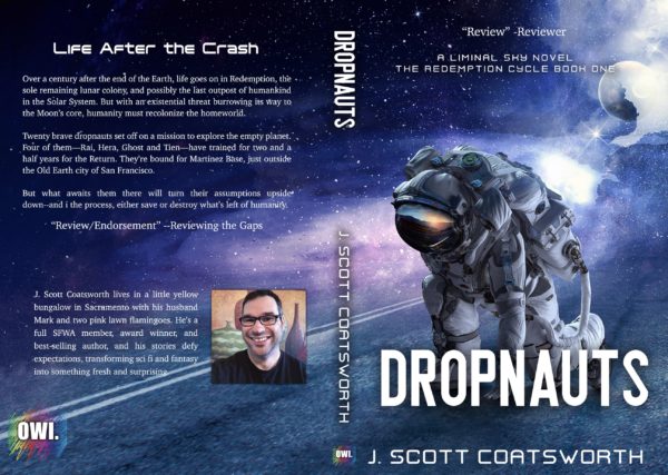
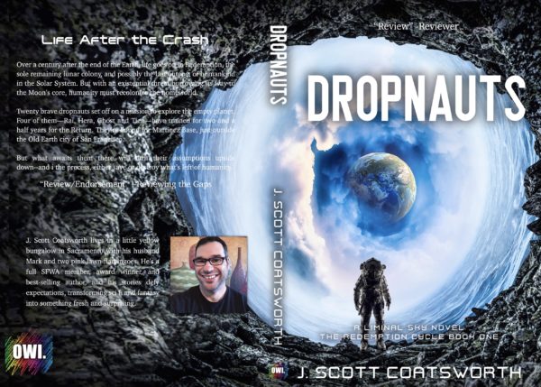
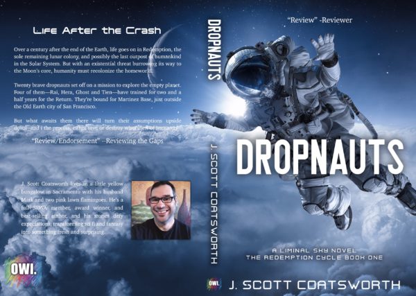
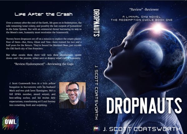
I found a bunch of things I liked, but none were perfect. So I made up a batch of test covers, and ran them by some friends whose opinions I trust:
I knew I wanted an astronaut (dropnaut) and probably the Earth in the background. I also wanted a hard-sci-fi feel
Different folks liked different covers, but a few common opinions emerged.:
The first was a little too “Disney.”The third one was a love/hate one – and the dropnaut’s pose just confused too many people, and the last one read a little too Young Adult.
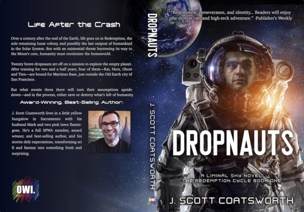
Then there was this one.
I really liked the feel of it, and it was one of my friends’ top choices, but several folks felt the model looked a little dopey.
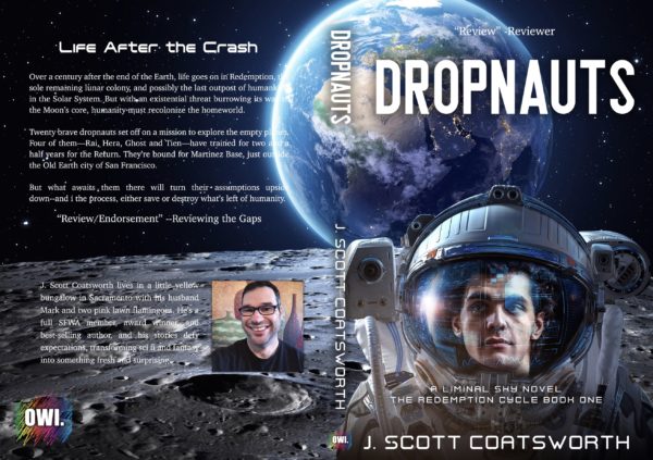
I agreed. I loved the guy from cover two in the gallery above, and knew I could merge the two with a bit of work
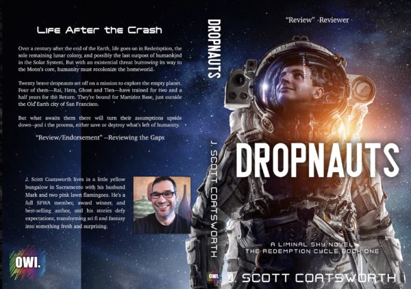
Three hours and a little photoshop magic later, I had my new cover. I switched out the face, blended it in, changed the coloring to include the orange sunshine reflection, brought the dropnaut down a bit on the cover, and added Earth in the top center, also matching the sun-glow:

I’m thrilled with the final result. It conveys some key elements of the story, and the original, gorgeous artwork has been modified to make it work for Dropnauts in what turned out to be a pretty seamless cover.
Biig thanks to Kelley York at Sleepy Fox Studios, who did the front cover typography for me. I’m getting better at that too, but her work has made my various sci-fi books/trilogies much more cohesive.
The finished book is gorgeous – I have a proof copy, and soon will release the real thing onto the world.
Then it’s on to the next book – and my next cover!
To my writing friends… if you make your own covers, what’s your biggest challenge? Share one you are really proud of.
